A UI designer designs the interface of a product and is responsible for its aesthetics and visual appeal. While the UX designer focuses on the overall experience, the UI designer focuses on enticing the user sensually.
UI designers work in close collaboration with UX designers and product developers. The UX designer describes their design requirements in detail, and the UI designer implements them, keeping in mind his responsibility to make it appealing. The developers then work with the UI designer to bring the product to life. A clear understanding of how UX designers and product developers work is essential for a UI designer.
As a UI designer, one needs to focus on the following aspects:
Table of Contents
Toggle1.Layout:
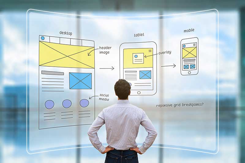
Each page in the product needs to be carefully designed, acknowledging white space requirements and content density. The designer also has to focus on areas of the screen that are more easily accessible. Screen accessibility could vary for a user based on her posture and activity, and the designer should address such changes.
2.Device Compatibility:
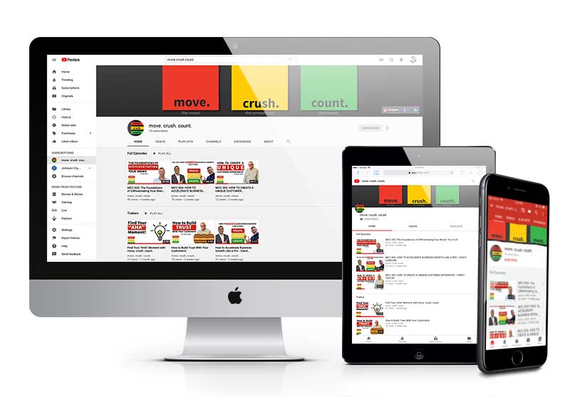
The user can access the product from various devices, so the design has to transform seamlessly across devices. For example, the kindle app may be designed especially for the Kindle device, but the app is used across devices and must accommodate their screen sizes.
3.Designing icons and objects:
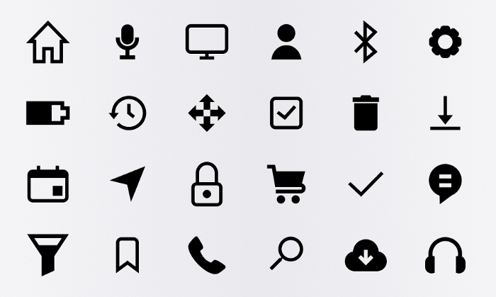
The size and shape of each component on screen and their positioning are crucial for UI design. Designers must design the objects to emphasize visibility and clarity, and they must be easily recognizable. Over time, some icons have been heavily associated with a function, and these conventions need to be respected. For example, a cut icon is usually a pair of scissors, and a close button is usually an X. Choices such as smooth edges or sharp edges, with or without a shadow, are a significant part of this process.
4.Color choices:
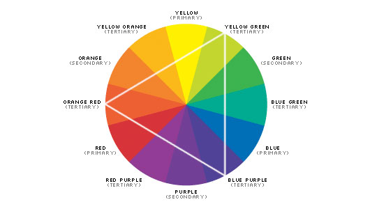
An understanding of colors and what they signify is essential. Colors convey and influence emotions. They have also been understood to convey information in our society.
The red color, for instance, usually makes one stop and observe, while the green usually signals a ‘go ahead’ message. However, no color is good or bad when it comes to visual appeal. While a certain section prefers dark and bright colors, another team would prefer a light and basic combination of colors. Usually, it’s a good idea to offer modes, but it’s recommended that the target audience be studied well to pick a style.
5.Fonts:
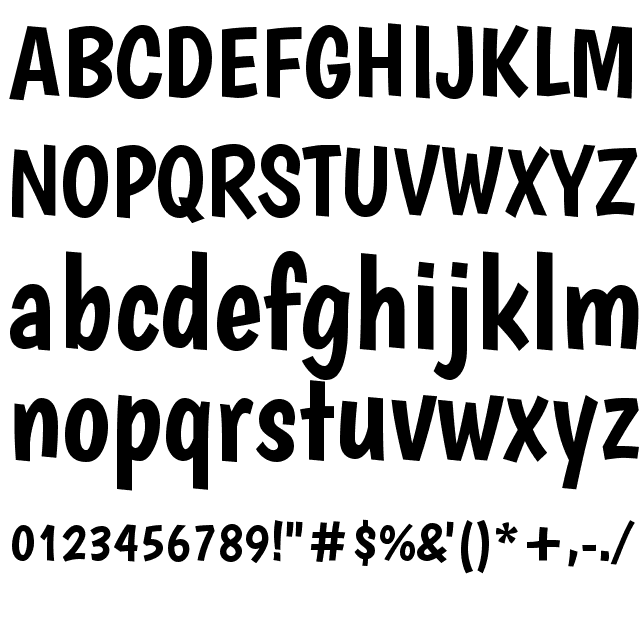
Although a bit underrated, fonts and typography choices could impact visual appeal. It is easier to understand this with very extreme and noticeable fonts that distinctly stand out, like “Monotype Corsiva.” However, with many fonts that appear similar to the layman, the differences are lost. This doesn’t mean the influence is any less, it just becomes less obvious. So, UI designers need to familiarize themselves with the available choices and implications.
6.Micro Interactions:

As against clicking on a button and not knowing even whether the click worked or not, people prefer to experience a signal when they interact with buttons. It also helps distinguish clicks and holds. These signals are often in the form of minor visual effects or vibrations. They liven up the page and give us cues about what we are doing.
7.Transitions and Animations:
Similar to micro-interactions, transitions and animations are used to indicate moving from one page to another, or completion of a particular activity which would help the users connect intuitively with the product. Animations also help to demonstrate what needs to be done next in a visual manner.
8.Maintaining consistency:
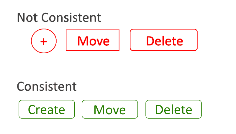
Some design choices require thinking a certain way, and that’s what such decisions need to be consistent across the product. The users get comfortable with a particular frame of mind assuming it fits the usage, but they get confused and frustrated when they face a contrasting design choice. For example, while most app pages have the back button on the left, it isn’t consistent if a specific page has the back button on the right.
9.Prototyping:
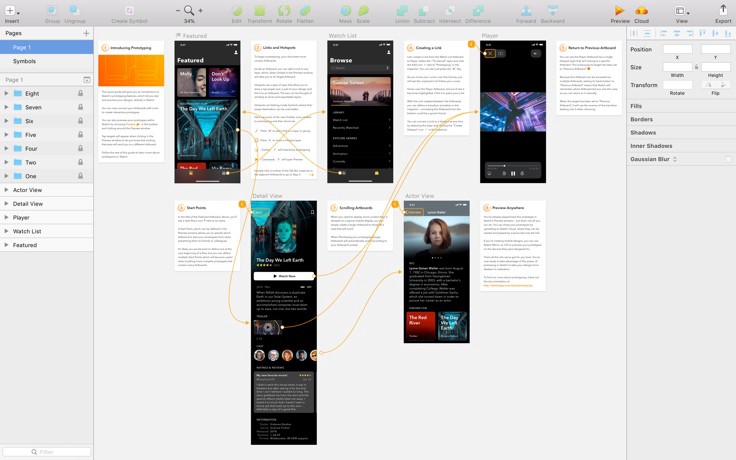
The UI designer often becomes a part of prototyping when the model is more realistic and is expected to be designed to fine detail. The UX designers usually develop basic prototypes to demonstrate functionality, but UI designers need to participate when the design is expected to resemble the end product visually.
10.Human psychology:
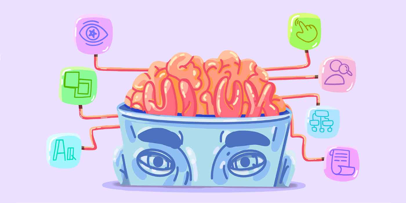
Although UI design is centered on visual appeal and aesthetics, a keen study of human psychology about design is necessary for a good UI designer. End of the day, it all boils down to how the user perceives design and how it fits their thought flow. And hence, it is an essential aspect of being a UI designer to understand the human mind.
In summary, a UI designer is accountable for everything that the user sees and hears. The job is to make these audio-visual experiences as attractive and comfortable as possible.
