Although the terms “User Experience design” (UX) and “User Interface design” (UI) are sometimes used interchangeably, they actually mean two separate things in the software industry. Both components are critical to the success of a product and function hand in hand.
User experience design is an approach to product development that puts the customer first. Every interaction between a company and a potential customer is covered under this umbrella term. UX design’s ultimate goal is to provide users with a smooth, efficient, relevant, and enjoyable experience for the customer. User Interface designs deal with the interaction between a user and a device or product and focuses on combining tasks aimed at product optimization.
Every year brings changes in the kinds of experiences that people enjoy and that is why staying updated on the trends is important. Let’s look at the different trends emerging in 2022 for UI/UX.
1. Data Visualization
Large volumes of information and metrics are translated into charts, graphs, and other visuals through the process of data visualization. It’s much easier to spot and discuss real-time trends, anomalies, and new insights when data is presented this way.
These visualizations, which combine user-friendly and aesthetically pleasing features, speed up research and data analysis, increase understanding in a short period of time, and serve as a powerful communication tool.
There are a few basic principles of Data Visualization that you can use to elevate your designs.
- Keep it Simple: Keep your visuals clean, easy to understand and don’t add unnecessary information which might confuse users.
- Focus on Key Messages: Keep the most important information at the left-hand corner of the center, as that quadrant is where the user’s attention is typically focused.
- Data Determines Visualizations: Understand the data you have to represent, and then you can look at the best match for the visual designs you can use.
- Patterns: Use patterns to present similar information. You can do this through chart types, colors or other elements. In addition, if you want to present a piece of key information, break the pattern to highlight the information.
2. Voice User Interface
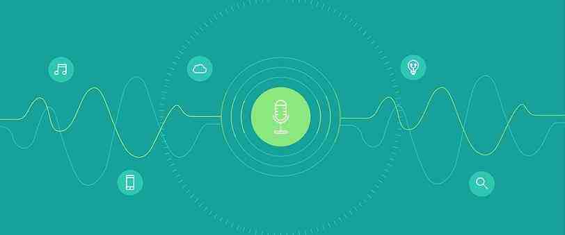
A Voice User Interface (VUI) allows people to engage with devices or apps through voice commands. A VUI is a combination of several Artificial Intelligence technologies like “Speech Synthesis”, “Automatic Speech Recognition”, and “Name entity Recognition”.
Voice User Interface has become a new trend in the UX market thanks to the growing popularity of voice assistants like Alexa, Google Assistant or Siri. As a VUI is distinct from a visual medium, the design elements under consideration are also completely different.
Therefore, why don’t we look at a few key elements to consider when crafting a VUI:
- User Research: This can include detecting patterns in user behaviors, anticipating user needs and understanding what drives them. At this juncture, the aim should be to see where VUI can address the pain points of the user and improve user interaction.
- Device Design: This can be a platform to see what the capabilities of the device are. You can add a fun twist by adding a distinct character to the design. Using competitor analysis to see the most commonly used voice interactions can help you create a better conversation flow with the user.
- Address Needs: This is where the user research and device design pay off. You have a definite look at the user’s pain points, needs as well as ideas for improvements. You can now get around to designing different scenarios and how the VUI interacts with each.
A good VUI can act as a virtual assistant and help smooth the way for the user by carrying out reminders, tasks and answering any questions that the user has.
3. Microinteractions
Microinteractions are the specific moments of interaction between the user and the interface they use. Their sole purpose is to make the user interaction with the design engaging and intuitive. Simply put, a microinteraction can be anything from pulling down the screen to refresh a webpage to the “Skip Intro” button on Netflix or the “Like” button on Facebook posts.
A good microinteraction helps empower the user by providing feedback or tips, improve website navigation, increase user engagement, and ultimately generate positive feelings towards your brand or service.
Microinteractions can be broken down into four essential components:
- Trigger: A trigger initiates an action. It can be triggered either from the user end of the system. A user-initiated trigger occurs when the user initiates an action. In a system-initiated trigger, certain preset criteria must be met in order to initiate action.
- Rules: The rules determine the response of a microinteraction when it is triggered. It sets the parameters of the action. For example, swiping to go to the next image in a gallery shown by a website.
- Feedback: This is where the user is informed of what is happening in a microinteraction. Anything a user experiences, sees or hears during the microinteraction is the feedback. This can range from a notification indicating you’ve missed a field to a notification that the system action is in progress.
- Loops and Modes: These refer to the meta-rules of the microinteraction and how it changes on repeat action. It also determines the length of the microinteraction. Remember when your washing machine chimes occasionally to remind you you have wet clothes? It also repeats the actions at frequent intervals. This is an example of the loop.
A microinteraction must always be designed with the user in mind and how to make their experience more pleasant and easier to repeat.
4. 3D Design
3D design is the process of using software to create a mathematical representation of a 3-dimensional object or shape. 3D designs are emerging as the main way we communicate ideas and inspire designs that can make a product better. They become doubly important as we find ourselves relying on film, video games and tv shows to see us through endless days of lockdown.
Integrating a good 3D graphic design to your web and mobile terminals requires a blend of design skills and an artistic eye. It has to be attention grabbing and hard for users to skip.
An advantage of using 3D designs is the enhanced photorealism, which can boost user interface when integrated well into the product design.
We’ve brainstormed a few ideas on how you can use 3D Design to make your UX/UI experience better.
- Storytelling: Using stories to bring your idea or product to life can be revolutionary. You can communicate to the heart of the user with a compelling narrative. You can use element placement and play with dimension to upgrade the user interaction.
- Backdrops: Your backdrop can make or break your product or idea. A picture is worth a thousand words. With the right backdrop, you can convey a powerful and compelling narrative to your user.
- Finishing Touch: The last idea is to go back to the designs you already have with a fine-toothed comb. Ask yourself if you see something small you can improve on. Sometimes, these minute details can make your product look more polished and vibrant.
The visual presentation connects the human elements with the idea. It is crucial to give you a better platform for both marketing and the experience of the user.
5. Artificial Intelligence
Artificial Intelligence, or machine learning, can now power UX processes ranging from the analysis of data to creating design deliverables. This means that UX designers can use artificial intelligence to design easier workflows and to improve the user interface.
Using artificial intelligence can help increase efficiency, automate processes and reduce the cost of transforming digital landscapes.
This is done by gathering data, analyzing user interactions and predicting these interactions. When this pattern recognition of the user is done on a large enough scale, you can reliably predict the next steps of the user.
Let’s look at how machine learning can help enhance user experience. Some key principles at making the process more effective are:
- User-Centric Machine Learning: The focus for this should be anticipating user needs. Identify what the user values and build on it. What matters here isn’t the automation tool but the outcome of the process.
- Automation: One of the greater benefits of AI-driven UX is automation. With automation, you can expect a more effective user experience because annoying, repetitive tasks are made easier. With greater data analysis, the opportunities to personalize the experience are also increased.
- AI-Driven Results: Users are growing to rely on artificial intelligence to make decisions. To make them continue to rely on your AI, it is vital for you to improve the quality of your results.
- Against Automation: Though it may sound counterintuitive, there are some key elements that make the user experience more enjoyable. It is up to the individual designer to make sure that these design elements remain under user control and are not automated.
Eventually, artificial intelligence can help in the personalization of user experience for humans, but it cannot replicate the independence and creativity of the human mind. As long as there are humans interacting with an interface, there will always be a need for human UX designers.
6. Neumorphism
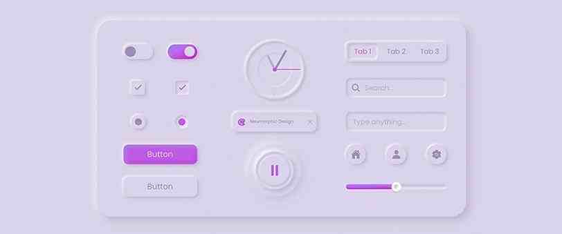
Neuromorphic design is a contemporary visual aesthetic for software, apps and websites. Neuromorphic designs are best suited for digital products. All this creates a soft finish and a simplified realistic look.
The Neumorphic design is a blend of skeuomorphism and a flat design. Skeuomorphic design is where you replicate an icon that resembles the original; Like a trashcan for the recycle bin.
A flat design is a graphic design with the bonus typography of Sans Serif.
The Neuromorphic design has three core principles-
- Monochromatic Color Scheme: This design makes it easy for the eyes of the user. It also presents a good canvas for resenting a strong
- Use of Shadows: This can create a 3D render and add depth and dimension to buttons and other elements.
- Minimal Contrast: With minimal contrast, you can make the design look modern and reduce the strain on the eye. This creates a cohesive look for the website.
It creates a simple, cohesive and visually consistent product that can keep its key aesthetic even when updated. One of the drawbacks of the Neumorphic design is that it could impact visually impaired users negatively and work against easy accessibility options.
7. UX Copywriting
User Experience Copywriting is a form of copy-writing that allows users to be guided to a particular goal or action intuitively. We can create a customized user experience with copy writing by addressing two key facets- meeting people’s needs and intuitive flow.
UX copywriting is meant to persuade the user to complete a task or take action. Its primary goal is not to sell, tell stories, or create a strong brand image (although it can help do all these things.) Instead, it is concerned with getting users to where they need to go.
UX copywriting is typically focused on the copy that no one notices, also known as ‘microcopy.’ Buttons, menu headers, 404 notices, pop-ups, instructions, and page headers are all examples of this.
8. Simple User Onboarding
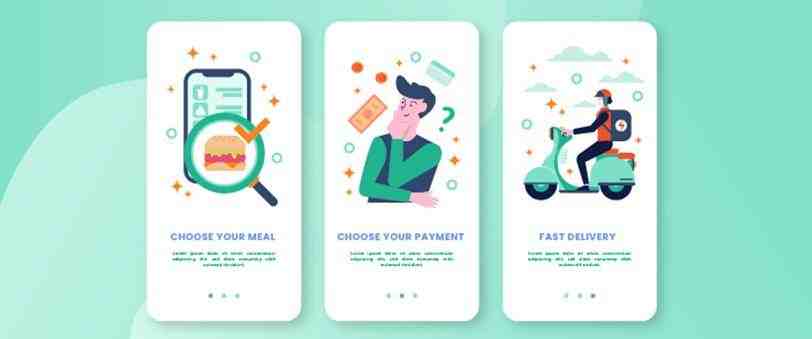
Onboarding is the process of helping new users understand and experience how your product is going to help them achieve their goals. It is like a walkthrough of the product features in a short and easy manner.
The goal here is to promote user retention by making the user experience better. The best way to do that is by paying attention to two things – the user experience of the design and the effectiveness of the product.
Some of the best practices to keep in mind when providing the best user experience are
- Know Your Audience: User research can help here, as you need to know the average user and their pain point.
- Focus on the ‘Wow’ Factor: Utilize the onboarding process to remind customers why your software or service is the greatest fit for a certain requirement. If your onboarding journey incorporates personalization, explain to consumers why you’re inquiring about their unique preferences or circumstances and how this will improve their experience.
Make it Easy and Quick: The best approach here is to take a function-based approach or a learn-by-doing approach. Giving the user a taste of the basic functions that is broken into a simple and quick step-by-step.
Every User onboarding is unique and varies according to the type of product designed. If you succeed in ensuring a pleasant onboarding, your user retention will increase. Though it is not a guarantee of success, it can definitely boost your chances.
In conclusion, UX/UI trends in 2022 will emphasize speed, clean and visually appealing page designs, simplified onboarding experiences with a mobile-first strategy, and, most significantly, artificial intelligence.


