Table of Contents
Toggle3D Design Elements
Hyper-realistic, lifelike images are becoming increasingly popular as designers seek to blur the lines between the digital and the real worlds by using new technologies that add greater detail and textures to their online creations.
It goes without saying that these 3D visualizations will have a huge impact, not just as an additional feature, but as the primary focus of the entire page.
3D design techniques are proving to be especially effective for advertising brands. They can quickly engage the attention of the target audience, help them connect more with the brand or product and convey their message in a compelling way.
The trend in 3D graphics currently is to combine photographs and illustration components along with experimenting with movement and animation.
What’s next? Everyone is sure be awestruck by the 3D typography patterns and lifelike forms and characters that will take center stage in the designs of 2022
Geometric Shapes
Following the highly publicized overhaul of Google’s icons in late 2020, it’s probable that colorful geometric blocks and circles (which have changed the G-suite logos into more minimalist versions of their earlier designs) will continue to gain popularity over the next year.
A benefit of geometric forms in graphic design is that they can assist your brand achieve uniformity, order, and visual structure when paired with various sorts of imagery.
Whether isometric or 2D, geometric elements are easier to read, user-friendly, help create fun and appealing illustrations, and do the job of visualizing data right. You can incorporate these simple shapes to represent data points as well as display content.
In 2022, there will be two prominent ways of using geometric shapes in graphic design.
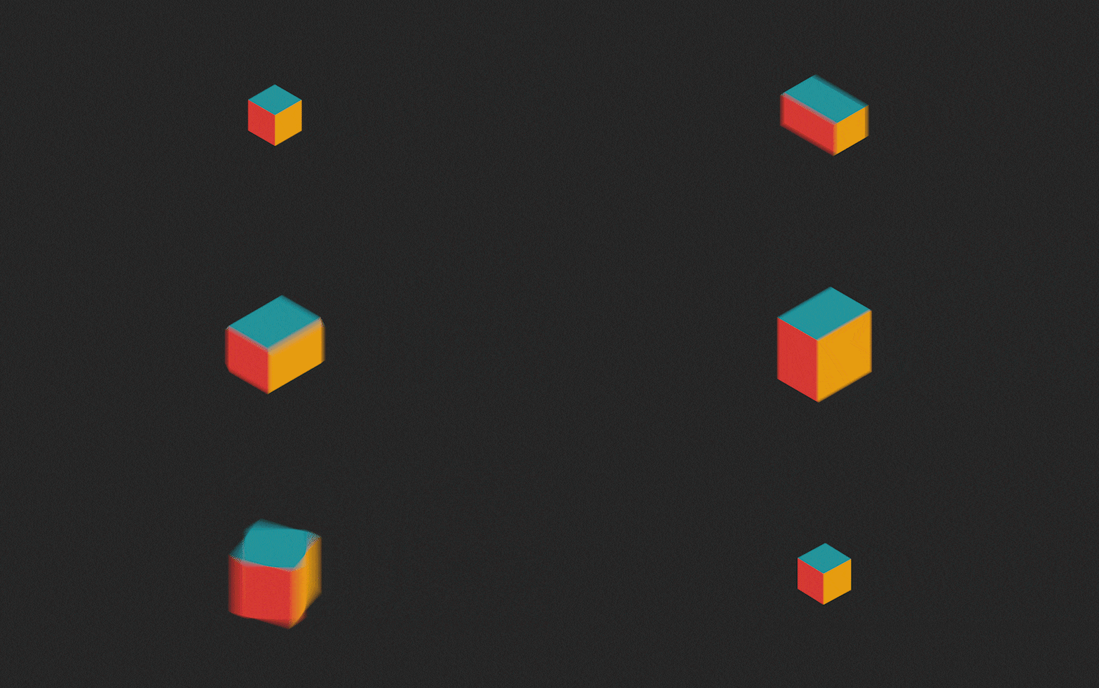
Firstly, simple flat geometric elements will be incorporated into larger compositions to create more complex design layouts. Secondly, 3D Geometric shapes will be used to add depth, shadow, and gradients to simple blocks designs.
Classic Serif Fonts
The digital world of website design and application development needs fonts that can capture and hold the user’s attention, scale well at all sizes, and are easy to read.
In terms of typefaces, it appears as though the trend in 2022 will prefer serif rather than sans serif fonts.
Deciding on which one is best for you is determined by your brand’s narrative, values, and target consumer.
Sans serif logos and designs are an excellent choice for start-ups and tech firms like Google, Yahoo, and Spotify who want to appear trendy and cutting-edge with minimal and simplistic visuals.
If, on the other hand, you run a more traditional business with a long history or work in a more “traditional” field and want your brand to appear trustworthy, established, and reliable, serif is the way to go.
Vogue, Time Magazine, and Honda are all excellent examples of this.
In the wake of the pandemic, many businesses are trying to recreate campaigns which make them appear dependable and calming as that is what users need to see right now. Hence, using serif fonts which date back to the 18th Century will help create that old-world comforting effect and lend an aura of credibility to your designs.
Vibrant Nostalgia
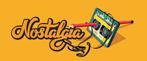
Nostalgic design incorporates aspects such as 8-bit imagery, retro typography and motifs, vintage color schemes, and a slew of other nods to previous decades.
These “vintage” components have a more natural look and are extremely different from the filtered images we see today. They can combine with more design elements to produce a “something old, something new” style, which can help bring back fond memories of years past and appeal to our sense of security and comfort in the things we already know and love.
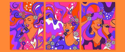
Vintage comics, contemporary pop art, and the 1960’s psychedelic look are all set to make a comeback in the following year’s designs.
Retro-inspired brands will experiment with vibrant colors and unique typefaces from the 1970’s, as well as neon and cyberpunk designs from the 1980’s. However, the most significant trend emerging in 2022 appears to be the 1990’s grunge and pop-culture look.
Vintage has always been relevant on FB and Instagram, but in 2022 it will become mainstream.
Gradient Coloring
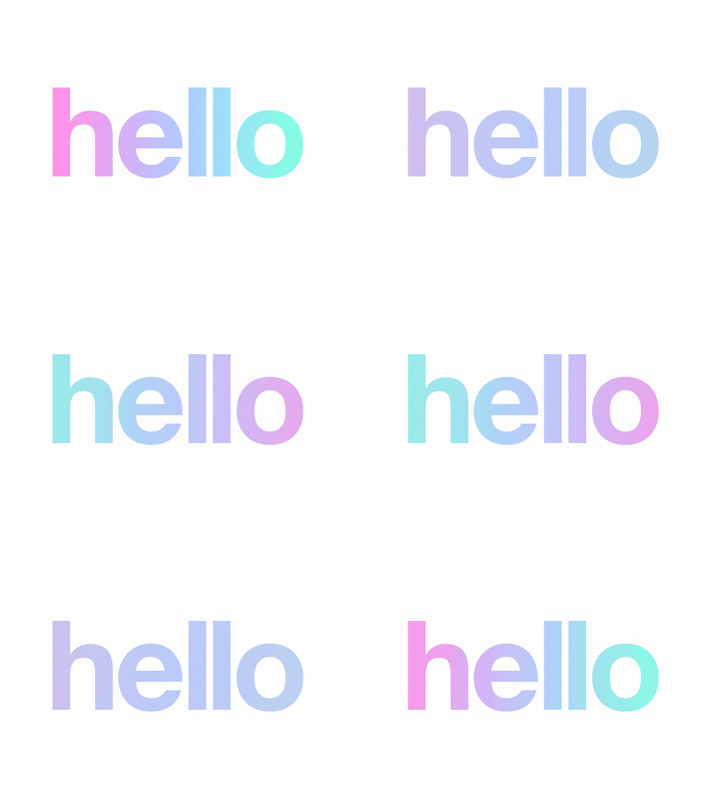
A gradient is a combination of two or more colors that gradually blend into one another, creating a progressive change from one color to the next. The greater the contrast between a soft background and a highly expressive element, the better the marketing result.
With its eye-catching style, nostalgic feel and capacity to blend with texture elements to create spectacular pictures, this trend is making a significant comeback in 2022.
You can use a gradient as a background or as a focal point depending on your design goals. It can also be used to emphasize typography, soften geometric shapes with subtle shading, and bring life to flat or isometric illustrations by incorporating shadows and highlights.
It is possible to combine gradients with bold design choices, flamboyant colors, subdued palettes, or practically any other combination you can think of. It is likely that the gradient effect will be widely used in all outdoor advertising in the coming year.
The key to making it work is to choose colors that set the correct tone and provide enough contrast for other design elements to stand out.
Optical Illusion, Surrealism, And Parallax Effect
How many times have you been captivated by the mesmerizing effect of an optical illusion in an ad or an image design?
You probably stopped scrolling to let your brain figure out what your eyes are seeing.
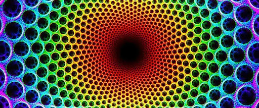
The most popular form in this genre is the illusion of movement. By creating the sense of movement in your design, you can elicit physical and mental responses from your viewers—even if the movement is merely implied.
It can also provoke a sense of sharing (like “what do you see?” or ‘how cool is that image?’), which in turn stimulates a discussion between others, thereby broadening the initial reach of your brand.
Its best to use these types of designs if your brand or messaging is associated with movement, spirituality or is venturing into a nice marketing space.
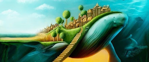
Surrealism can be a refreshing take on incorporating elements from the surrealistic technique of painting. The basics cover unusual color contrasts, combining unlikely images or typography that removes the usual significance from ordinary, everyday objects.
In graphic design, the main elements of Surrealism used by brands and marketing visuals are the depiction of the unconscious, use of distorted figures, and illustrations of irrational thoughts and dreamlike scenes which force the mind to make unusual connections, think-outside-the box, and rediscover our lost sense of mystery.
Another graphic trend that could dominate 2022 is the parallax scrolling effect.
This means the web page background in a site scrolls at a slower rate than the foreground which creates a faux -3D effect within a website’s two-dimensional scene.
How does this impact graphic design?
Parallax scrolling brought a new option for designers to break away from the previous rule of having as much content above the fold as possible in order to avoid the user having to scroll, and has also made the act of scrolling itself more enjoyable for the user.
These trends can be used in conjunction with each other or separately to create stunning visual appeal.
Anthropomorphism is the process by which human features and physical characteristics, feelings, and actions are ascribed to animals or other non-human elements.
The assigning of human traits to inanimate objects is a novel way to establish rapport and form authentic relationships with consumers.
Anthropomorphic form is most effective when utilized to tell a story or convey information about a product’s function. It can be used to establish a brand’s identity, but it can also be used to educate users about how and when to utilize items.
Think of the iconic coke bottle. Its shape conveys the contours of the feminine form and hence represents sexuality, vitality, and elegance.
In the tech world for instance, digital assistants like Alexa and Siri take on anthropomorphic forms when they’re designed to sound like humans.
These designs tap into the hidden characteristics and the innate assumptions and associations of their target audience.
Earlier versions of the Macintosh operating system (pre-OS X) displayed an icon of the computer with a happy/sad face to inform the user of the machine’s status.
What significance does this have?
The Macintosh OS, particularly in the early days of personal computing, sought to be a humanistic product rather than a sophisticated addition machine. Hence its anthropomorphic form emphasizes the significance of this design approach. Firstly, it clarifies the product’s functionality and reduces resistance to the novel or foreign, and secondly, it enables consumers to develop a meaningful understanding of the product’s purpose, resulting in a more appropriate engagement with it.
In the coming year, Anthropomorphization will be seen as a prominent design aesthetic that helps provide that definitive voice and character to brands to satisfy their consumers desire for human connection.
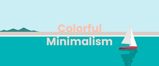
Colorful Minimalism
Why is minimalism likely to be a big trend in 2022?
Stripping down the elements to a bare minimum allows for a deeper connection between the visual and the viewer. Working with only a few design elements gives the designer more opportunity to really delve into the emotional reaction that the piece is intended to convey.
The tenets of this school of design are to balance the composition, judiciously use negative space, to use only one or two colors in a simple layout, and to add a flat image or an icon using a single layer.
However, a recent trend in minimalism is oriented towards using a two-color palette and pairing it with one accent color (preferred over texture) to illustrate the core message of the design effectively.
A perfect example of the minimalistic design aesthetic are Apple’s products and marketing campaigns which use neutral and muted color palettes with limited text.
Simple Data Visualization
Thanks to our unparalleled access to data today, we seem to be bombarded with information on all platforms.
But how much of this information is relevant, retained and used to make a decision?
To help brands convey the right amount of information in a meaningful and interesting way, data visualization is used.
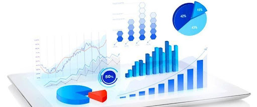
The simplification of data can take the form of pie charts, histograms, or bubble charts which break down the critical details that need to be conveyed.
Another trend in data visualization is using infographics with geometric elements and customized color palettes to present vital information and express the brand voice.
A significant trend for 2022 will be the use of dynamic data visualization for complex real-time data — such as dashboard statistics — to present information which adapts to changes.
Monochrome Effect
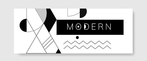
The term monochrome effect can refer to the use of black or white or to the use of one base color and adding tones, tints, and shades of the same color to create a contrast.
It is a variation on the theme of the duotone trend from 2017.
Monochrome palettes give your design a modern, chic, and appealing appearance.
This is a popular technique that meshes well with the minimalist design style, instantly creates a sense of harmony even in the most complicated of designs, produces dramatic and striking results in photography, and helps show relationship between elements and gradual progression in a design.
This is why it’ll be a big part of the graphic design trend in 2022.
Psychedelic Design
Abstract psychedelia, which dates back to the 1960’s hippie era, is a graphic design technique that resulted from substance use and societal turmoil.
Artists believed that the artistic medium was a chance to open people’s minds, which helped create a divide with traditional art.
One of the main ways psychedelics set itself apart from the rest is through the use of fantasy themes, kaleidoscopic patterns, vibrant color palettes and distinct typography. The use of gradients in the design provides dimension to the image, while the vibrant and saturated color palette establishes the hallmark aesthetic.
Psychedelia is likely to emerge as a trend in 2022 with creative and niche brands incorporating vivid and complex colors, distorted shapes, and abstract components into distinctive and playful design layouts.
As the trends in the graphic design world are constantly changing, so should you.
Improving design layout techniques and deconstructing and reconstructing visual hierarchies are evolving to meet the needs of consumers. What helps set a truly skilled Graphic Designer apart is the ability to keep learning continuously and experiment with new techniques.
