UX designers are hired to design a new product or enhance its usability. The designer’s job is to do their research, identify problems and work on a design to solve them. But how do they go about this process? How do they contribute to the design?
Before we get into that, a UX designer needs to be mindful of a few things before they set out on any project. These are the seven significant characteristic components of UX design that validate the effectiveness of a design.
Useful:
A product has to be helpful to the consumers genuinely, and helpful doesn’t necessarily translate to utilities alone. Any product that adds a significant value to the consumer compared to their earlier experiences can be deemed useful. Ideally, a UX designer should not duplicate something that exists without improving on it.
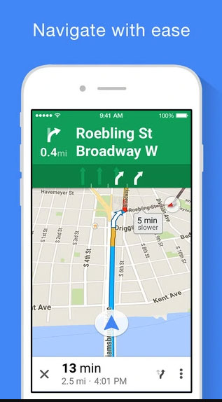
Usable:
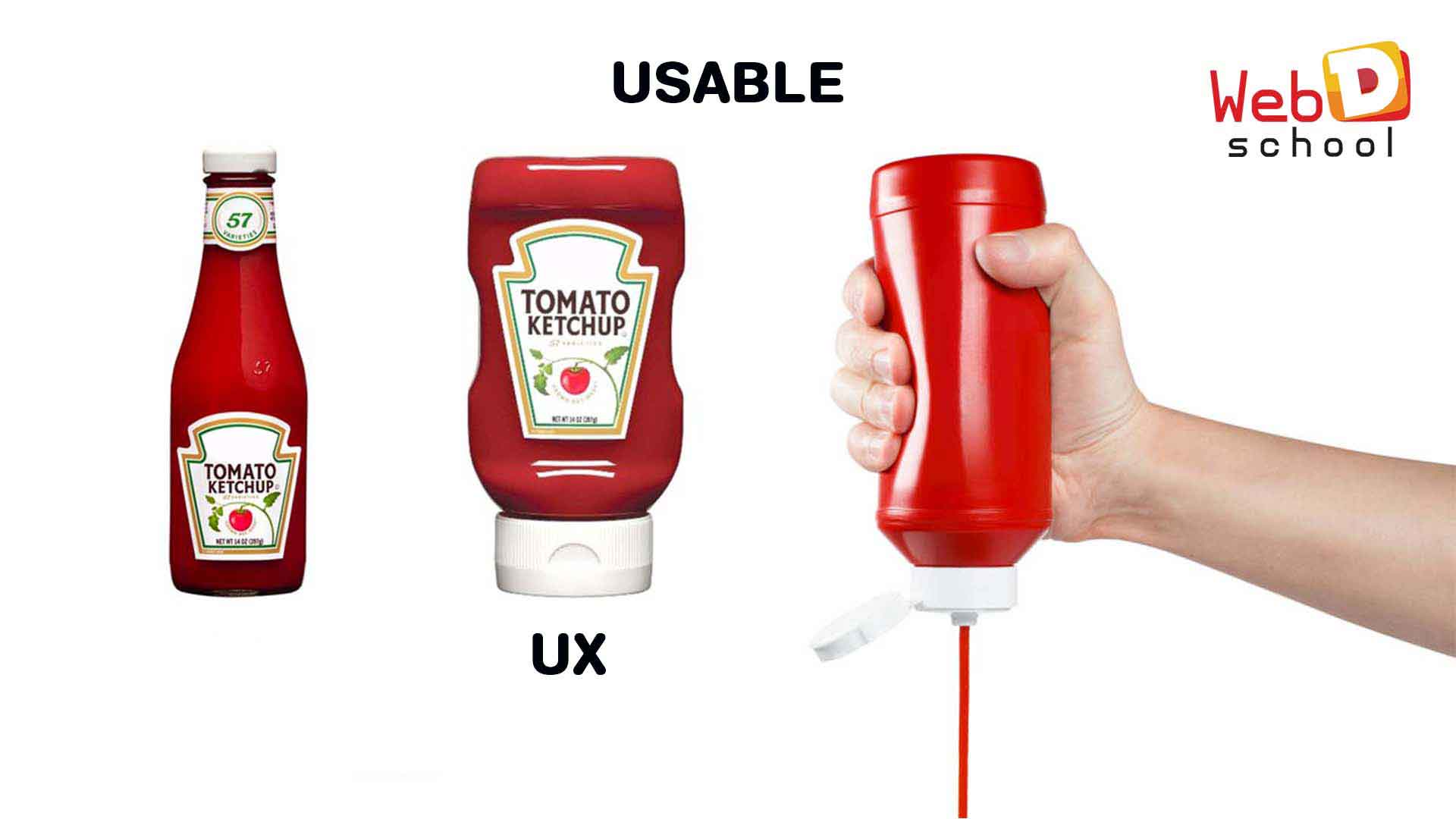
All users must use the product with the least possible effort. If some consumers fail to enjoy the benefits promised, that indicates a failed design. The product has to be designed with smooth functionality in mind and considering all varieties of end-users.
Findable:

The users should not struggle to find the product even when they know it’s available. If they are unaware of the availability itself, that’s just tragic. The product must be appropriately categorized and be available where the potential users would expect it to be. It must have a presence in the market and must frequently become the topic of discussion.
Desirable:
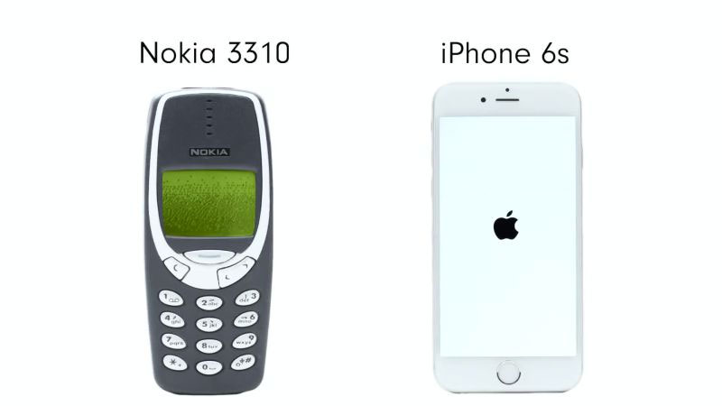
The desirability of a product is not a superficial aspect at all. It has the power to build and burn businesses. A UX designer can contribute to this by carefully planning the design to accommodate marketing and branding efforts and giving sufficient room for the UI designers to play with their options.
Credible:

Trust and confidence over a product are crucial for a user to pick the product up, especially if the brand doesn’t already have a strong presence in the market. So, it’s important not to break the trust of a user. This can be done by providing honest and simple descriptions for the product, and directing it towards users who could benefit from it.
Accessible:
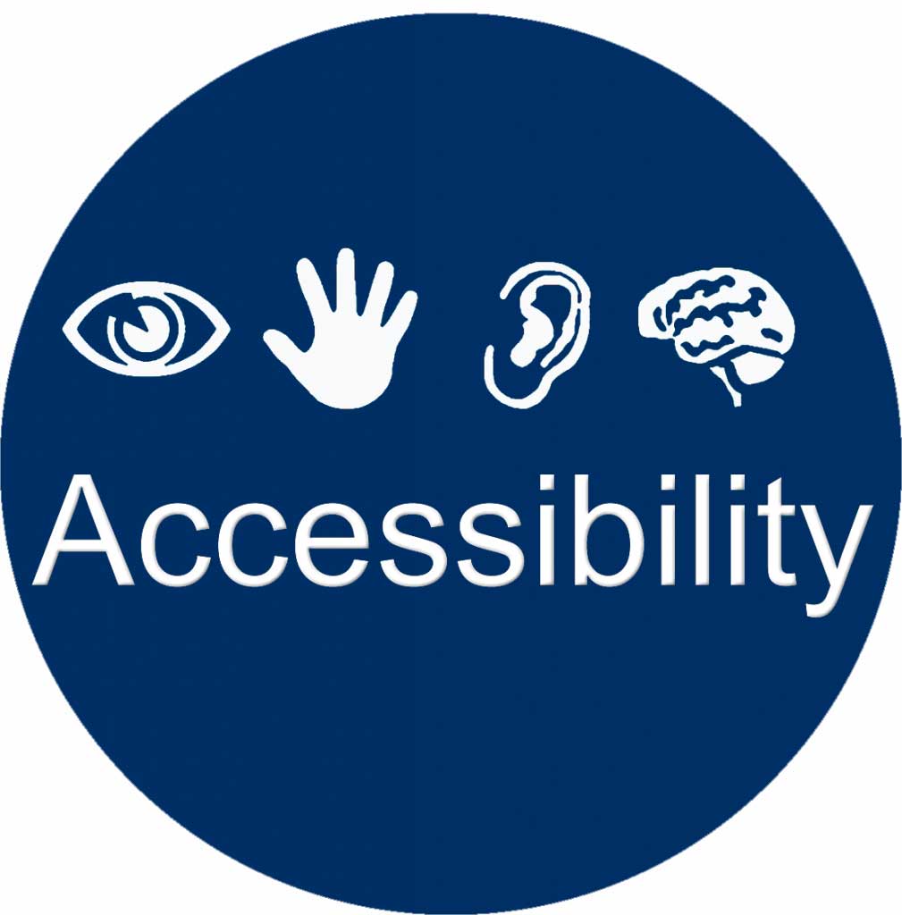
Not all of us are equally and identically capable of functions. Many of us live with physical and psychological limitations and restrictions regarding what we can do. A product has to be designed with these restrictions in mind. It should be accessible for every single user. Typically, the limitations are physical such as issues with sight. However, as human society evolves, psychology sheds light on various mental restrictions that people have.
Valuable:

Finally, using a product should be economically favorable for the user. If the product costs more than what the user might lose from the problem that the product is trying to solve, there is no point in opting for the solution provided by the product. Assume someone is trying to avoid buying a car because the EMI is too expensive; one cannot suggest a travel alternative that costs the individual more than the EMI he felt was expensive.
Once these things are in the back of your mind, you can set foot into the world of UX design. Let’s study the process in three parts for clarity: the research, the design, and the testing.
Stage I: Research

UX design is essentially a research-oriented job, and this part of the process is the most crucial. The designer must first identify the problems they are trying to solve from the end-user’s perspective. They have to collect user data from their website, or application if one exists. They need to take surveys and track user behavior. Consumption patterns need to be identified. Users have to be interviewed, and their problems & complaints should be taken note of for further analysis.
If a product is being designed from scratch, the users could be asked about products that currently serve the same purpose. For example, the first-ever mobile phone makers would probably have studied problems with a traditional telephone and improved on that.
The targeted demography should be studied deeply, and the psychology of the crowd must be analyzed. This could shed light on what the people seek from the product or what would delight them. Once the problems are identified, the research should consider potential solutions and whether they solve the problem without creating a few more.
The designer should observe the competitors and their solutions, or a lack thereof, for the problems identified. Their solutions should be compared with the designer’s newfound solutions, and a careful selection has to be made from the options.
Stage II: Design
The product will have designers often come up with user personas that roughly describe the categories of users and analyze their requirements to get an idea about the different kinds of end-users. For example, a music-streaming app could design personas based on their different genres and combinations. This helps in creating a sample population for clarity and reference.
Based on the research and user personas, the UX designer would create user flow in their heads to structure the consumption process. This structure is known as Information Architecture (IA). IA could be a separate field of its own, although it just usually overlaps with other areas such as content strategy and interactive design.
Typically, IA is about organizing and classifying information so that anybody looking for a piece of data could effortlessly navigate to where it is stored. IA helps identify where the user might have a hiccup in navigating through the product, so that the flow can be fixed.
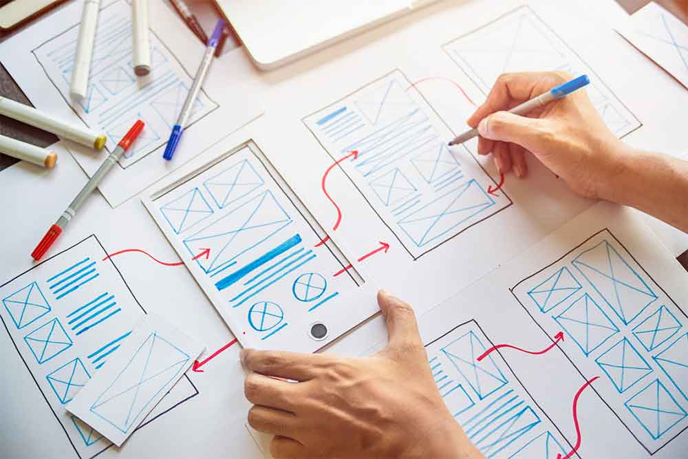
Once the design is conceived and nurtured, the design then has to be presented for others to study. This is done with the help of creating user flows and wireframes to represent the user experience on paper (or a screen maybe, as is now).
User flow outlines the process of consumption and is typically presented in flowcharts. For example, consider logging out of your Instagram account. Textually, it would be something like this:
- Open your Instagram, go to your profile page by clicking the profile icon at the bottom right corner.
- Click the menu icon at the top right corner of your profile page.
- Go into the settings, which can be found at the bottom right corner, and at the bottom of the settings page, you will find the logout option.
While this gives a picture of the flow, this could be better presented in a wireframe, which illustrates the flow so that the design becomes easier to perceive. Wireframes provide the visual designers and developers a better idea to quickly interpret the design.
Stage III: Prototyping and testing
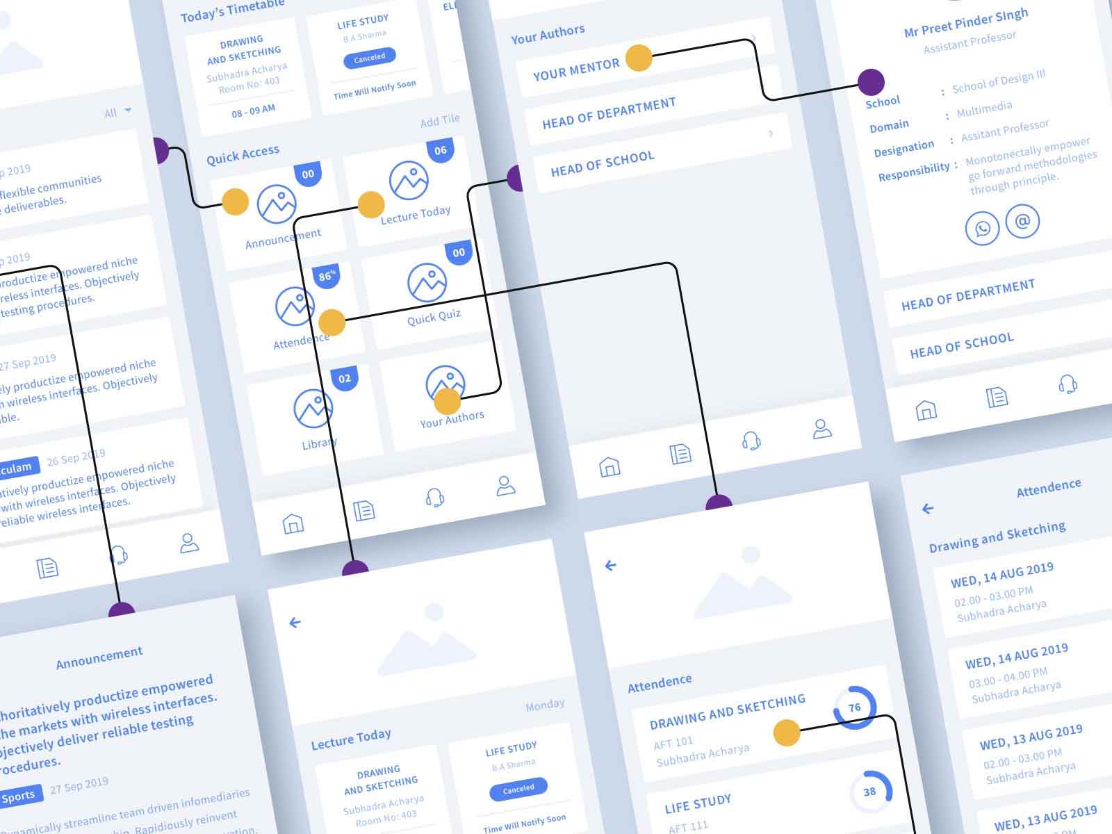
Once the design is ready for testing, a prototype is developed to present to the users participating in the testing process. These prototypes range from inanimate models that you could only see to functional products that look basic without much visual design work.
Low-fidelity prototypes are ones created with a low level of detail and functionality. While these are easier to produce, they imply the burden of imagination for the users to assess usability. High-fidelity prototypes are ones created with a high level of detail, and they almost resemble the final product. These are expensive, and it takes a lot of effort to effect changes in design, but the test results are more accurate, and they are more engaging. There is also the risk of users getting distracted by the visual design and overlooking vital functional areas.
The choice of prototype fidelity varies with budgeted time and resources available and based on the organization’s policies and strategies.
Takeaway
The stages mentioned above might conclude the process temporarily, but UX designers continue to contribute to their designs even after the product is launched. Continuous research often brings up new problems to fix and identifies room for improvement. So, the process is relatively perpetual.
